After some experimentation, research, and AI being stupid, I finally have a simple, clean implementation of a star rating component that uses only radio inputs and labels and allows for half steps. 50 lines of beautiful CSS. Let’s break it down piece by piece.
Before I dove into the code, I did some research on how others had tackled this problem with pure CSS. I found two implementations that I liked. Both used simple radio inputs and labels, which is essential to the solution I want. But, both had some limitations that I didn’t like. One didn’t support half steps, while the other relied on the FontAwesome font. I want to use simple background image SVGs and radio inputs. So, after digesting some details from those solutions, I turned to writing my own.
There are a handful of essential details. Let’s walk through them one by one.
The first detail concerns the HTML structure. Since we only want to use vanilla CSS, we have some constraints around the features we have access to. We can use the subsequent sibling selector to select elements after a hovered one. But, in a star rating component, we need to highlight the stars before the hovered one, showing which stars will be selected if the currently hovered radio is checked. In order to achieve this behavior, our HTML structure will put the radios in reverse order, from 5 stars to 0.5 stars:
<fieldset class="star-rating"> <input type="radio" id="rating10" name="rating" value="10" /> <label for="rating10" title="5 stars" aria-label="5 stars"></label> <input type="radio" id="rating9" name="rating" value="9" /> <label for="rating9" title="4 1/2 stars" aria-label="4 1/2 stars"></label> <input type="radio" id="rating8" name="rating" value="8" /> <label for="rating8" title="4 stars" aria-label="4 stars"></label> <input type="radio" id="rating7" name="rating" value="7" /> <label for="rating7" title="3 1/2 stars" aria-label="3 1/2 stars"></label> <input type="radio" id="rating6" name="rating" value="6" /> <label for="rating6" title="3 stars" aria-label="3 stars"></label> <input type="radio" id="rating5" name="rating" value="5" /> <label for="rating5" title="2 1/2 stars" aria-label="2 1/2 stars"></label> <input type="radio" id="rating4" name="rating" value="4" /> <label for="rating4" title="2 stars" aria-label="2 stars"></label> <input type="radio" id="rating3" name="rating" value="3" /> <label for="rating3" title="1 1/2 stars" aria-label="1 1/2 stars"></label> <input type="radio" id="rating2" name="rating" value="2" /> <label for="rating2" title="1 star" aria-label="1 star"></label> <input type="radio" id="rating1" name="rating" value="1" /> <label for="rating1" title="1/2 star" aria-label="1/2 star"></label></fieldset>This allows us to easily highlight all radios beneath the currently hovered/checked one:
/* color current and previous stars on checked */input:checked ~ label,/* color previous stars on hover */label:hover, label:hover ~ label { background-color: goldenrod;}If rating9 were hovered or checked, all radios subsequent in the DOM (so, rating8 and below) would be highlighted in goldenrod.
But, by having the radios in DOM order from highest to lowest rating, the component would render backwards relative to the expected order. Users expect to have the 0.5 rating first, followed by the 1 star rating, then the 1.5 star rating, and so on. So, we need the rendered order to be reversed from the DOM order. Luckily, CSS provides flex layouts which make it easy to reverse the order of elements via flex-direction:
.star-rating { display: inline-flex; flex-direction: row-reverse; justify-content: flex-end;}By making the .rate container a flex container with flex-direction: row-reverse, we can reverse the order of the stars in the UI while maintaining the needed DOM order.
This technique of having the DOM order be optimized for CSS selectors, while the UI order is optimized for usage is a powerful tool to have in your CSS toolbelt.
The next essential detail is rendering the stars. Supporting half steps makes this component notably more complicated. In order to keep things straightforward, I took the FontAwesome half-star icon and manually created SVGs for both a left- and right-handed half star, with no padding:
<svg xmlns="http://www.w3.org/2000/svg" viewBox="0 0 264 512"> <path d="M264 0c-12.2.1-23.3 7-28.6 18L171 150.3 27.4 171.5c-12 1.8-22 10.2-25.7 21.7-3.7 11.5-.7 24.2 7.9 32.7L113.8 329 89.2 474.7c-2 12 3 24.2 12.9 31.3 9.9 7.1 23 8 33.8 2.3L264 439.8V0Z"/></svg><svg xmlns="http://www.w3.org/2000/svg" viewBox="0 0 264 512"> <path d="M0 0c12.2.1 23.3 7 28.6 18L93 150.3l143.6 21.2c12 1.8 22 10.2 25.7 21.7 3.7 11.5.7 24.2-7.9 32.7L150.2 329l24.6 145.7c2 12-3 24.2-12.9 31.3-9.9 7.1-23 8-33.8 2.3L0 439.8V0Z"/></svg>I then convert these SVGs into backgroung urls, using the appropriate image for each label:
/* full star steps; right-handed half star */label:nth-of-type(odd) { background: url('data:image/svg+xml,<svg xmlns="http://www.w3.org/2000/svg" viewBox="0 0 264 512"><path d="M0 0c12.2.1 23.3 7 28.6 18L93 150.3l143.6 21.2c12 1.8 22 10.2 25.7 21.7 3.7 11.5.7 24.2-7.9 32.7L150.2 329l24.6 145.7c2 12-3 24.2-12.9 31.3-9.9 7.1-23 8-33.8 2.3L0 439.8V0Z"/></svg>') no-repeat;}/* half star steps; left-handed half star */label:nth-of-type(even) { background: url('data:image/svg+xml,<svg xmlns="http://www.w3.org/2000/svg" viewBox="0 0 264 512"><path d="M264 0c-12.2.1-23.3 7-28.6 18L171 150.3 27.4 171.5c-12 1.8-22 10.2-25.7 21.7-3.7 11.5-.7 24.2 7.9 32.7L113.8 329 89.2 474.7c-2 12 3 24.2 12.9 31.3 9.9 7.1 23 8 33.8 2.3L264 439.8V0Z"/></svg>') no-repeat;}Since we will render stars for the labels, we can simply visually hide the inputs:
input { position: absolute; width: 1px; height: 1px; padding: 0; margin: -1px; overflow: hidden; clip: rect(0, 0, 0, 0); white-space: nowrap; border-width: 0;}Then, we style the labels to properly render the background SVG images:
label { display: block; height: 2rem; width: 1rem;}The key detail is to have the width be half the size of the height.
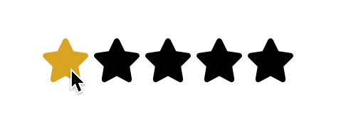
With the input elements visually hidden (but still accessible in the DOM for screen readers) and the label elements rendering the half star SVG images, we have the foundation for our component:
The next detail is to highlight the star segments on hover and selection.
This is unfortunately not possible with CSS background property using an embedded SVG url. You cannot dynamically change the fill color of an SVG background image using CSS. Luckily, we can take advantage of this technique and use the mask property instead of background, which allows a background-color to bleed through. So, we update our label CSS like so:
label { display: block; height: 2rem; width: 1rem; background-color: currentColor;}/* full star steps; right-handed half star */label:nth-of-type(odd) { mask: url('data:image/svg+xml,<svg xmlns="http://www.w3.org/2000/svg" viewBox="0 0 264 512"><path d="M0 0c12.2.1 23.3 7 28.6 18L93 150.3l143.6 21.2c12 1.8 22 10.2 25.7 21.7 3.7 11.5.7 24.2-7.9 32.7L150.2 329l24.6 145.7c2 12-3 24.2-12.9 31.3-9.9 7.1-23 8-33.8 2.3L0 439.8V0Z"/></svg>') no-repeat;}/* half star steps; left-handed half star */label:nth-of-type(even) { mask: url('data:image/svg+xml,<svg xmlns="http://www.w3.org/2000/svg" viewBox="0 0 264 512"><path d="M264 0c-12.2.1-23.3 7-28.6 18L171 150.3 27.4 171.5c-12 1.8-22 10.2-25.7 21.7-3.7 11.5-.7 24.2 7.9 32.7L113.8 329 89.2 474.7c-2 12 3 24.2 12.9 31.3 9.9 7.1 23 8 33.8 2.3L264 439.8V0Z"/></svg>') no-repeat;}This now permits us to highlight the star segments on hover using a simple background-color change:
/* color current and previous stars on checked */input:checked ~ label,/* color previous stars on hover */label:hover, label:hover ~ label { background-color: goldenrod;}Likewise, we can style the appropriate star segments based on checked state similarly:
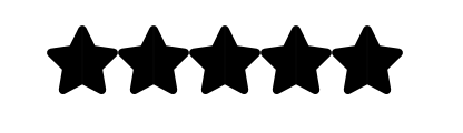
/* highlight current and previous stars */input:checked + label:hover, input:checked ~ label:hover,/* highlight previous selected stars for new rating */input:checked ~ label:hover ~ label,/* highlight previous selected stars */label:hover ~ input:checked ~ label { background-color: gold;}This makes our component beautifully interactive:
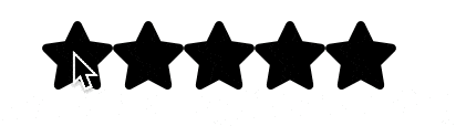
The final detail is adding a bit of spacing between the stars, but in such a way that the hover interaction is smooth and natural. My initial idea was to add a bit of margin to the full star step elements:
/* full star steps; right-handed half star */label:nth-of-type(odd) { mask: url('data:image/svg+xml,<svg xmlns="http://www.w3.org/2000/svg" viewBox="0 0 264 512"><path d="M0 0c12.2.1 23.3 7 28.6 18L93 150.3l143.6 21.2c12 1.8 22 10.2 25.7 21.7 3.7 11.5.7 24.2-7.9 32.7L150.2 329l24.6 145.7c2 12-3 24.2-12.9 31.3-9.9 7.1-23 8-33.8 2.3L0 439.8V0Z"/></svg>') no-repeat; margin-inline-end: 0.25em;}But, this created a fragmented hover interaction:
Whenever the mouse is between stars, no stars are highlighted at all. This creates a fractured user experience, where stars are highlighted and unhighlighted in a disjointed manner. What we need is a way to ensure that there is a visual gap between stars, but when the mouse is in that visual gap, it is still technically hovering over a star segment. We can accomplish this by adding expanding the width of the label elements for the outer, half step star segments, while keeping the image width the smaller fixed width:
label:nth-of-type(odd) { mask: url('data:image/svg+xml,<svg xmlns="http://www.w3.org/2000/svg" viewBox="0 0 264 512"><path d="M0 0c12.2.1 23.3 7 28.6 18L93 150.3l143.6 21.2c12 1.8 22 10.2 25.7 21.7 3.7 11.5.7 24.2-7.9 32.7L150.2 329l24.6 145.7c2 12-3 24.2-12.9 31.3-9.9 7.1-23 8-33.8 2.3L0 439.8V0Z"/></svg>') no-repeat; width: 1.25rem; mask-size: 1rem;}The key detail is that the mask-size equals the default width of the stars and the width for these segments includes some visual padding. Here, I have done it manually, but we can also use CSS properties and the calc() function:
/* settable properties */--star-size: 2rem;--star-gap: 0.25rem;/* computed properties */--star-height: var(--star-size);--star-width: calc(var(--star-size) / 2);--star-width-plus-gap: calc(var(--star-width) + var(--star-gap));Either way, by expanding the width of the right-hand star segments, we create a gap between the stars that still triggers the hover styles on the visually preceding star segment. This ensures that the hover interaction is seamless and continuous, providing a smoother user experience.
The only other final detail is to remove the final margin on the right-hand side of the component:
label:first-of-type { width: 1rem; /* or width: var(--star-width) */}We use the first-of-type selector because, remember, the far right star segment is actually the first star segment in the DOM order. Now, the star-rating component is exactly the width of the stars. If you are using the fieldset element as the wrapping element, you may want to remove the border as well:
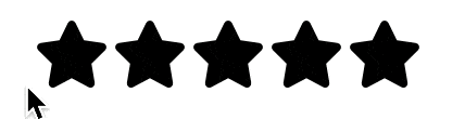
fieldset { border: none;}But, with all of that, our vanilla CSS star rating component is now complete. It is fully functional, responsive, and accessible. It also provides a smooth user experience with no visual gaps between stars:
If you want to see the full code, check out the playground. And, if you’ve enjoyed following along, you would likely enjoy following my Twitter account: @fractaledmind.